Alright, y’all. I feel like I have to preface this post by telling y’all that I don’t drink. As in, not at all. I don’t drink socially. I don’t drink at home. I’ve never been drunk a single time in my entire life.
The reason that I’m telling you that is because if I hadn’t prefaced with that, and I had just jumped right to showing you the paint color decisions I made over the last two days, you might be tempted to think that I spent my weekend choosing paint colors while inebriated. I can assure you that didn’t happen. I almost wish it were true because at least I’d have an excuse. But as it stands, I have no valid excuse.
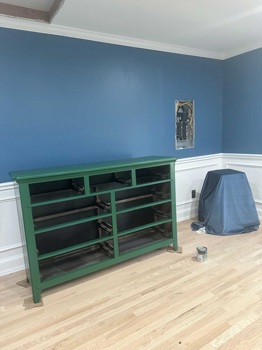
So Saturday morning, I posted the neutral paint samples I had picked up for the bedroom dresser. I didn’t like a single one of them, so I did three mockups of the dresser in green, orange, and coral. Of those, the green was my favorite. I actually really liked this green.
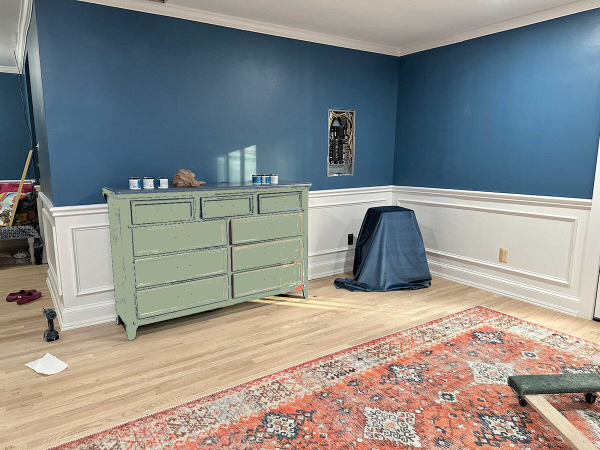
After deciding on green, I headed to Home Depot to get paint, and somehow I wound up with this. 😀 I mean, I can’t even explain it. I can generally tell you how my thought processes work, and how I wind up making a certain decision. But this? I have no explanation for it. But just so that I can save face here, I’m going to blame it on the Home Depot fluorescent lighting, okay?
So then yesterday, I went to Sherwin Williams to see what they had. My mom had suggested that I use a much darker green so that it wouldn’t demand so much attention. She thought a darker green might kind of fade away and not become a focal point. So I went with this color.
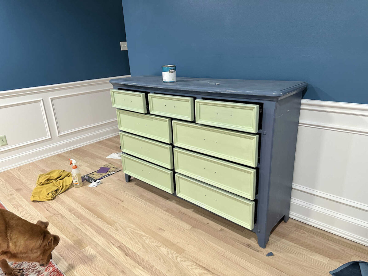
And yeah. It’s all wrong. I only had one coat left to go on the drawers, and it would have been finished. Finished…and completely wrong.
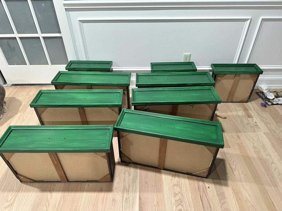
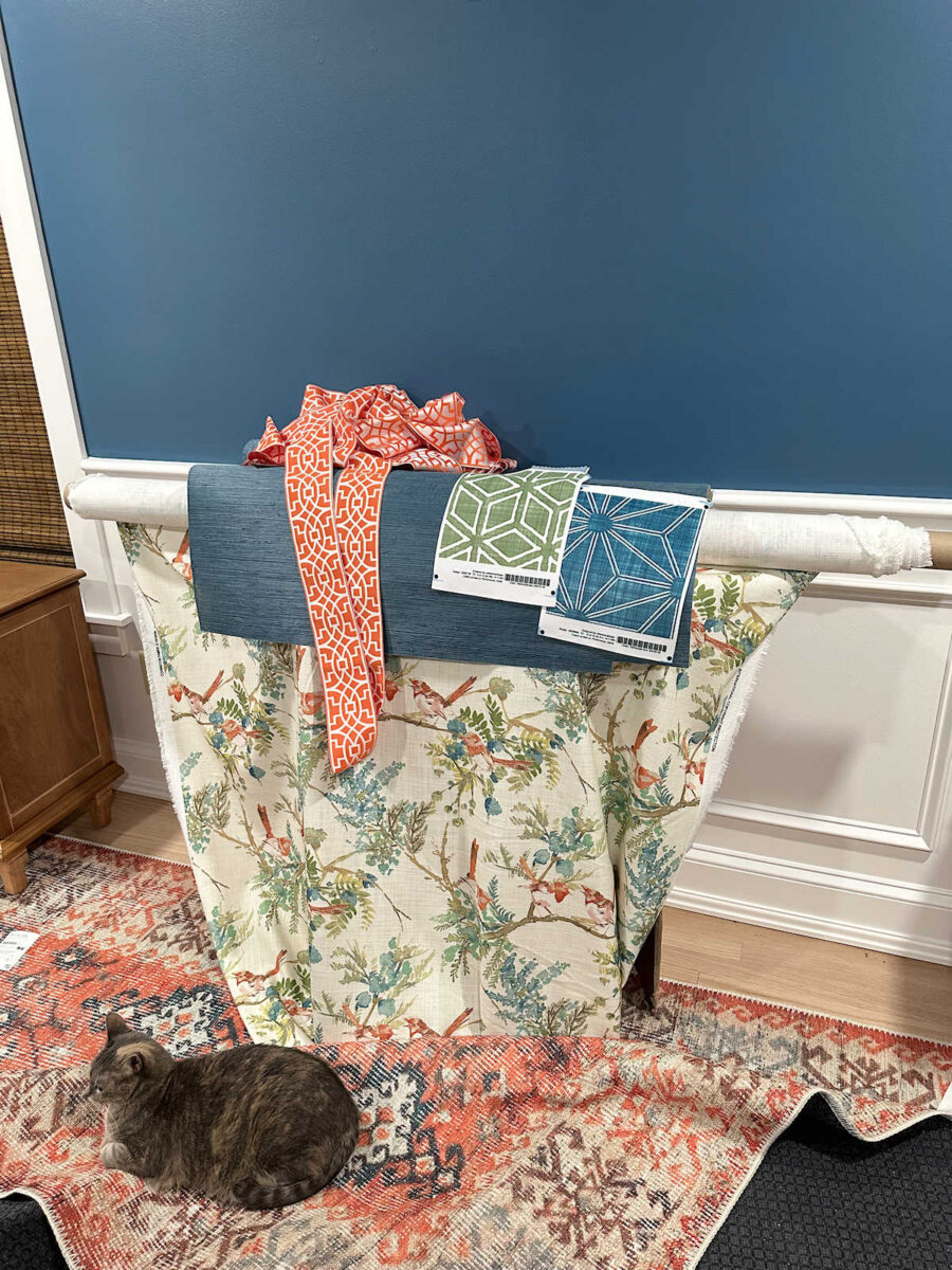
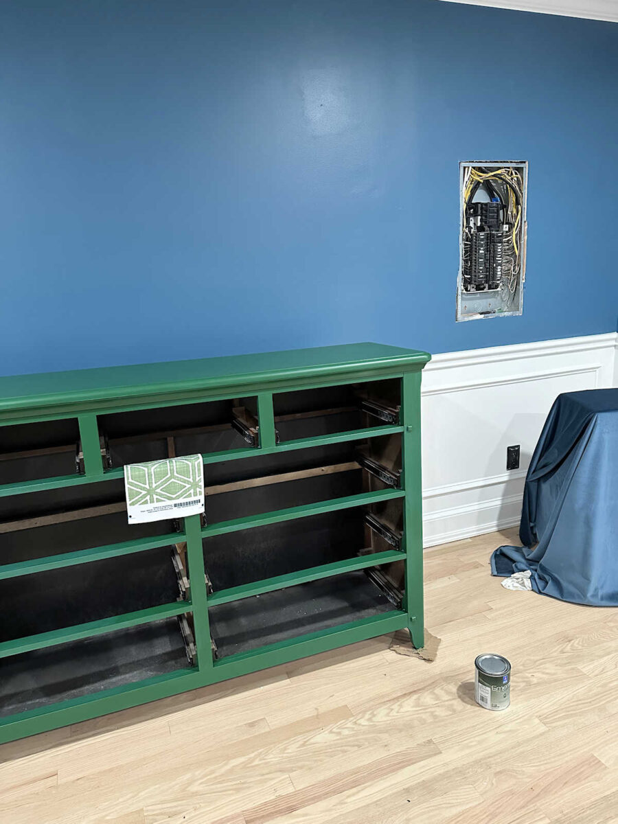
So here’s that dark green after two coats of paint. I think the color is called Shamrock. The picture looks funny because I sent it to my mom, and I had folded the area rug back onto itself, so the really dark gray backing on the rug was showing. She removed that because it was really distracting.
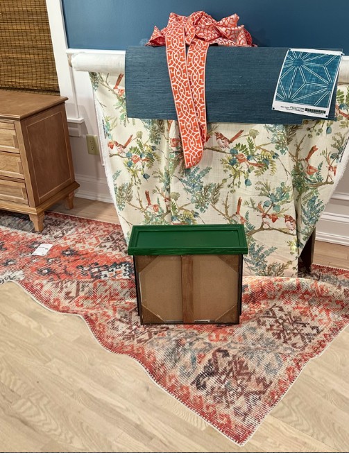
And then she tweaked the color of the drawer and sent it back to me. She thinks I should go more this direction with the green.
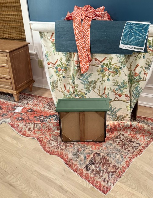
And then she did a mockup of the dresser with the rug and other items.
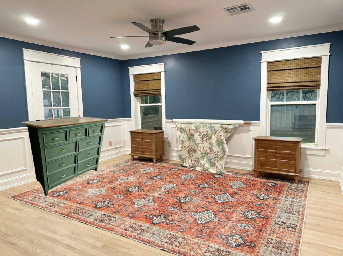
Here’s the deal. I like that green. I think it’s very pretty. I even think it goes really great with the room and the fabric. In fact, it’s pretty perfect as far as going with the bird fabric.
But it doesn’t look like a color that goes in my house. It looks perfect for someone else’s house, though. For my house, it needs to be a bit brighter, clearer, and livelier. So I went back to the fabric samples that I had purchased for the foyer bench. I’m going to use this green cube print on that bench, and that green happens to go pretty great with the bird fabric.
So I’m going to try again today, and I hope to end up with something that actually looks good but doesn’t demand to be the focal point. I’m not feeling too confident right now, but we’ll see what I can come up with. Maybe I can actually pull this off.
More About Our Master Bedroom
see all master
bedroom diy projects

read all master
bedroom blog posts

Addicted 2 Decorating is where I share my DIY and decorating journey as I remodel and decorate the 1948 fixer upper that my husband, Matt, and I bought in 2013. Matt has M.S. and is unable to do physical work, so I do the majority of the work on the house by myself. You can learn more about me here.
Trending Products